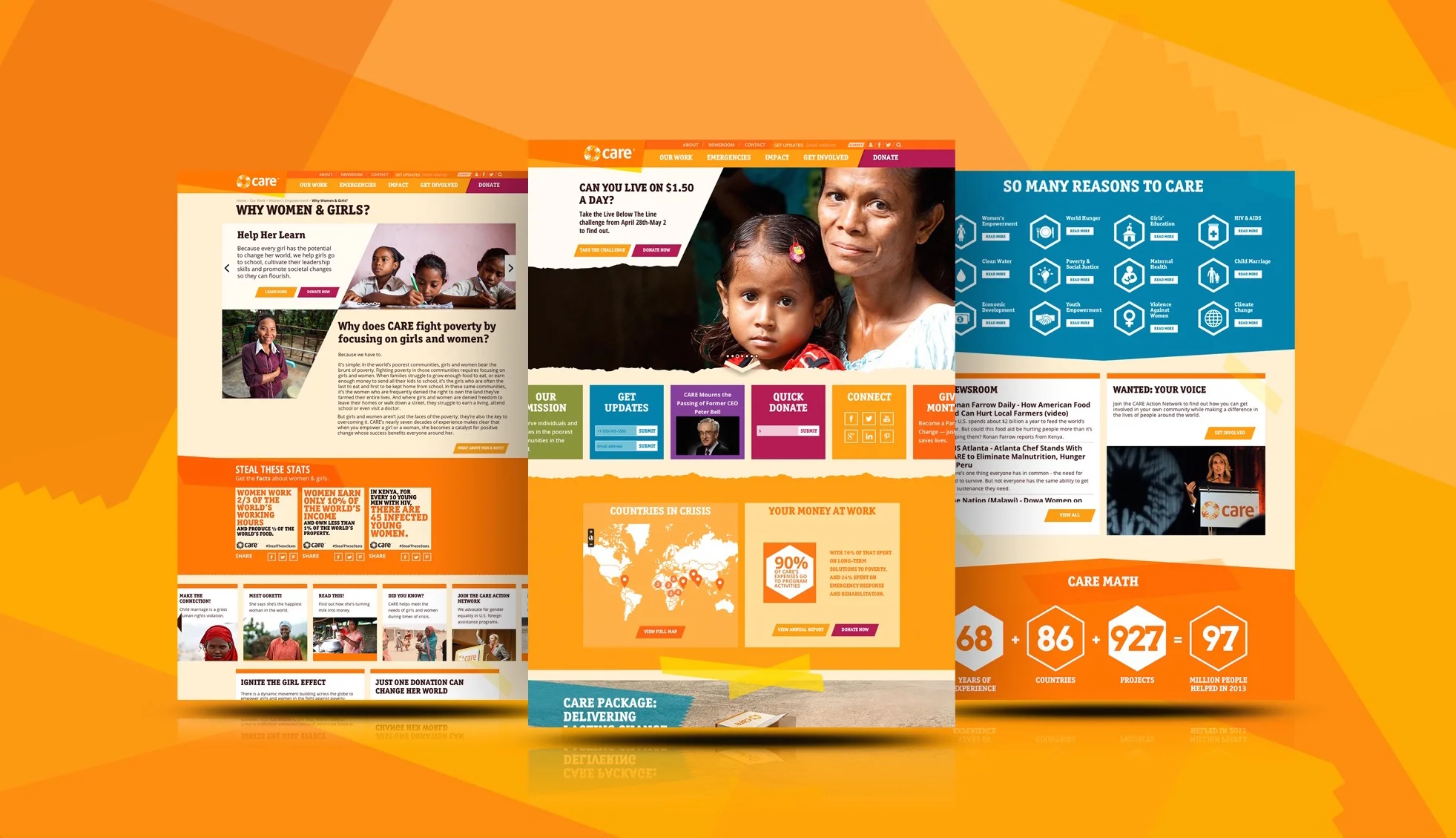
CARE.org Digital Strategy & Redesign
I was the associate creative director and content strategist for this 10-month website redesign project. I provided content strategy services, including a full site audit and navigation restructuring, to streamline CARE's deep well of compelling content. I also managed and produced web- and mobile-friendly copywriting to transform the site's key sections into stories that inspire and drive fundraising actions.
The Challenge
CARE — a force in the fight against poverty since 1946 — asked PBJS to make its online presence as urgent and essential as its work. Going far beyond mere web design, our job was to make this non-profit stand out from the crowd — capturing the attention and dollars of a whole new donor generation, while positioning CARE as the voice of the global movement to end poverty by empowering women.
We had a four-part mission:
Make CARE cool
Win the next giving generation
Enrich the supporter experience
Shape the women-and-girls conversation
The strategy
Make CARE’s message bold, unmistakable and immediate. With CARE’s urgent, multi-faceted mission and vast capacity for moving and authoritative storytelling, we knew we needed put the best content front and center, while giving CARE’s web team the tools to react within moments of a disaster.
Content and design strategies focused on removing barriers to action and giving potential donors the information they need to make informed, confident decisions. Based on our website and brand audit, plus fundraising, demographic and competitor analysis, we recommended a messaging approach that would make CARE’s content customizable and shareable, make CARE commercial, equate CARE with creative innovations and get CARE to think like a verb.
The solution
A vibrant, content-centric design that connects people with humanitarian issues of the greatest urgency and drives donations and engagement through vivid storytelling. PBJS built a responsive, device-agnostic site with a CMS platform that makes emergency and other site updates quick and efficient.
The results
Shortly after launch, the site’s new emergency-preparedness features were put to the test when Typhoon Haiyan hit the Philippines — and CARE’s web team was able to funnel donations and advocacy to the storm’s victims with unprecedented ease. Our web design refresh and content overhaul increased CARE’s critical end-of-year fundraising income by a double-digit percentage in the 2013 holiday season.
In 2015, CARE.org was recognized by EveryAction.com as one of the 100 Best Nonprofit Website Designs. CARE.org was included in the Things of Beauty category ("On trend and on form, these sites are a pleasure to behold.") and lauded for its "simple, bold, responsive" design with well-presented content and calls to action.
Roles:
Associate Creative Director
Content Strategist
Digital Brand Strategist
Campaign Creative
Copywriter


